Exhibition building
Accessing the Exhibition editor
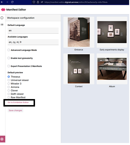
From the Manifest Editor, when you are ready to access the Exhibition editing tools to work on the IIIF Manifest you've created, click on the 'Settings cog' in the bottom left hand menu. This opens the Workspace configuration for the Manifest Editor. Clicking the link 'Go to Exhibition Editor' will open your Manifest in the editor:
Introduction to the Exhibition editing mode
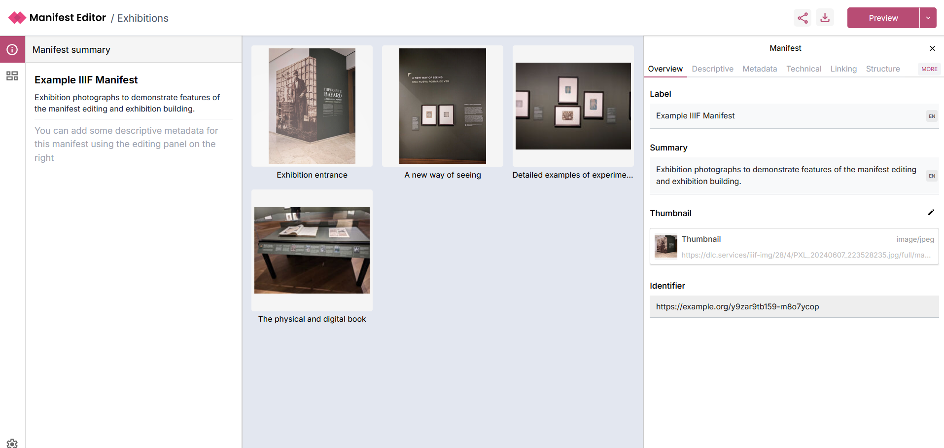
The left hand panel allows interaction with the individual “slides” (aka Canvases) that make up the exhibition. These are simply the canvases which are present in the IIIF Manifest you are editing.
The centre grid view presents the contents of the IIIF Manifest, whilst the right hand panel presents the Manifest metadata.
Editing the exhibition
Clicking the Exhibition grid icon on the left navigation, opens the Exhibition grid view where you can see an outline of your exhibition.
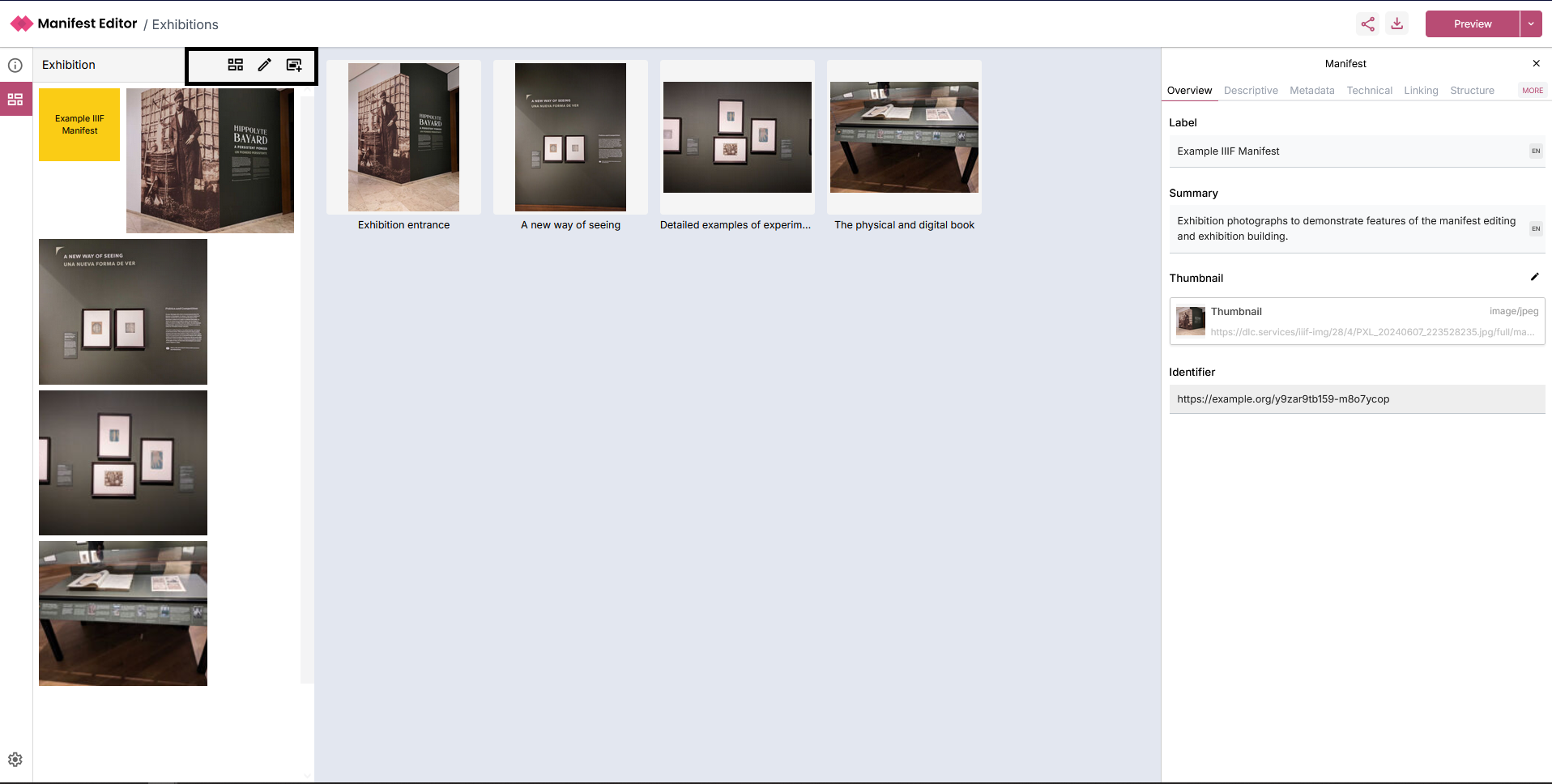
There are a number of controls:
- 'Grid view' which enables you to view the exhibition as a grid, essentially providing a "Preview" of the exhibition you are creating.
- 'List view' you can toggle the 'Grid view' to display the slides in the exhibition as a list.
- 'Edit slides' allows you to reorganise and update the order of the "slides" (aka Canvases) within the manifest.
- 'Add a new slide' enables you to add content as slides to your exhibition manifest.
When you click on a slide in the left hand panel (or via the centre grid view), the right hand panel presents additional exhibition specific metadata options for each slide.
Editing and updating your Exhibition manifest
The first thing you will note is the initial “title” information box, which is preset to the current yellow background and it presents the IIIF Manifest title. This is the default setting for the Exhibition introduction and we'll explain a little bit more about that during the workshop.
As we are working with a IIIF Manifest created in the Manifest Creation and Editing step, a number of exhibition specific settings will need to be applied. These settings will determine aspects of the layout and behaviour of the exhibition manifest when viewed in the standalone Exhibition Viewer a little later.
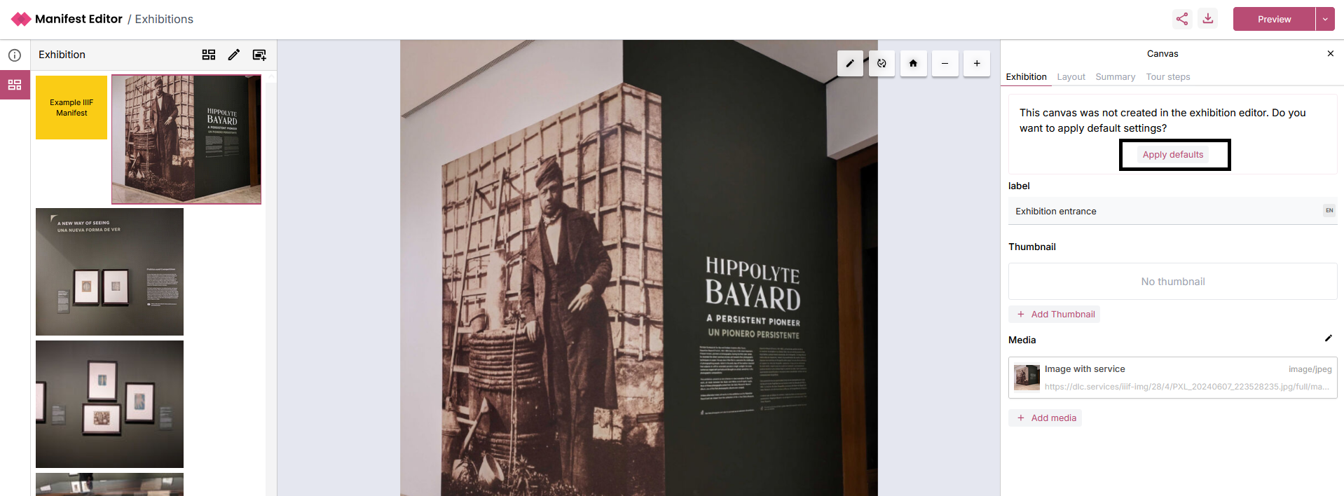
When you click on a canvas, the right hand side metadata panel presents the 'Exhibition' tab, which contains an option to ‘Apply defaults’ which allows you to quickly select some basic layout options for the canvas based on the existing content:
Once you select this option, when you navigate to the ‘Layout’ tab, you’ll notice what has been applied:
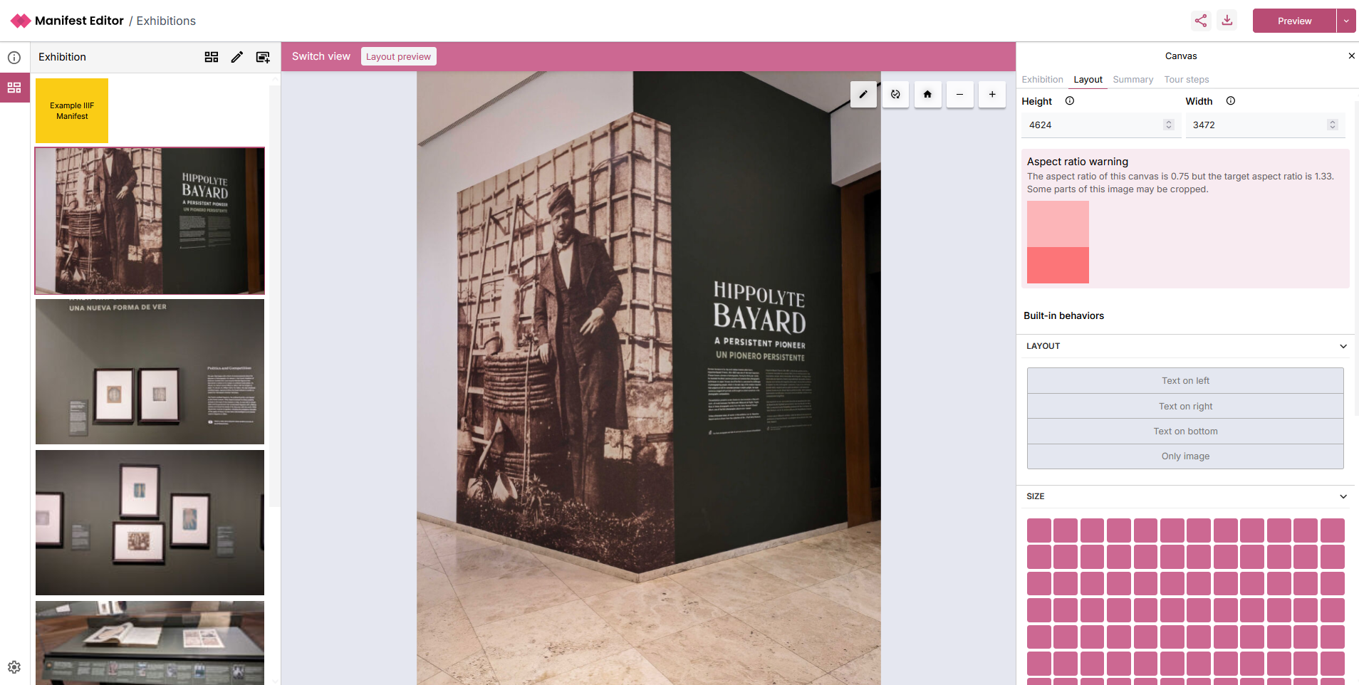
Aspect ratio
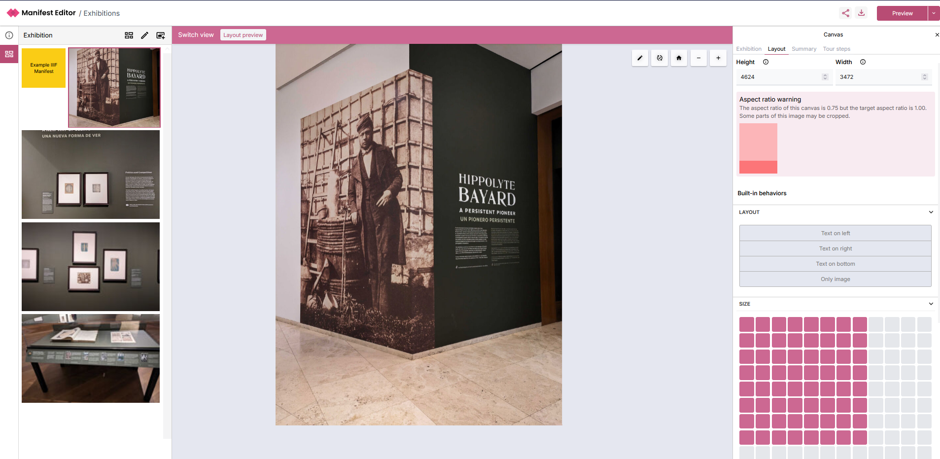
This will indicate a warning if applicable. You can use the ‘Size’ option to adjust the image appropriately and assess how well your changes apply to your selected content.
As you alter the size, you’ll see how the changes impact the exhibition layout in the left hand exhibition grid:
Behaviours
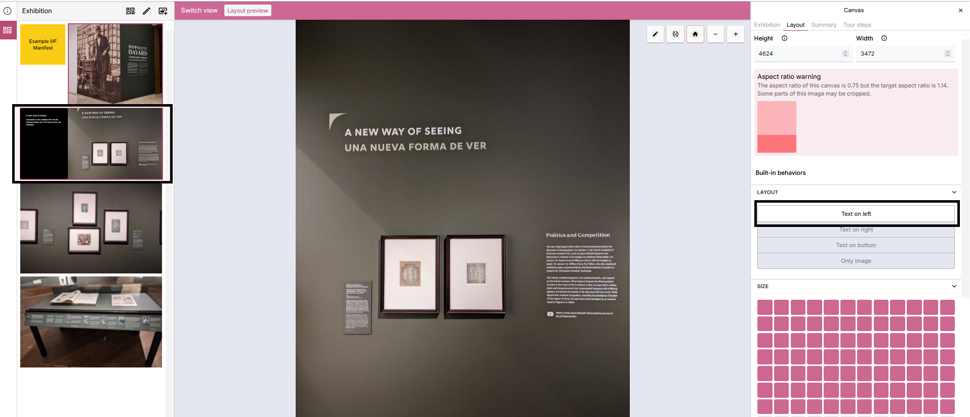
There are a number of layout behaviours that are available which can be applied to your slides:
- Text on left
- Text on right
- Text on bottom
- Only image
These determine how to present the slide (Canvas) Summary information presented on the ‘Summary’ tab in the right hand panel, when viewing the exhibition manifest in the standalone Exhibition Viewer.
In the example below, ‘Text on left’ is selected which will result in the Label and Summary text being presented in a text component next to the image within the Exhibition Viewer. The effect of this change can be partially previewed in the Grid view in the left hand panel:
Summary
The 'Summary' tab presents the existing (Canvas) Label and Summary values if added for the current slide. This information can be presented as part of the exhibition, using the behaviour controls mentioned in the previous section.
These values can be edited and updated as needed.
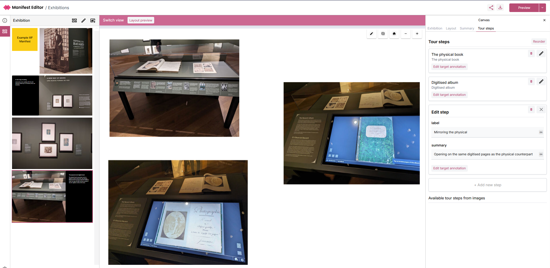
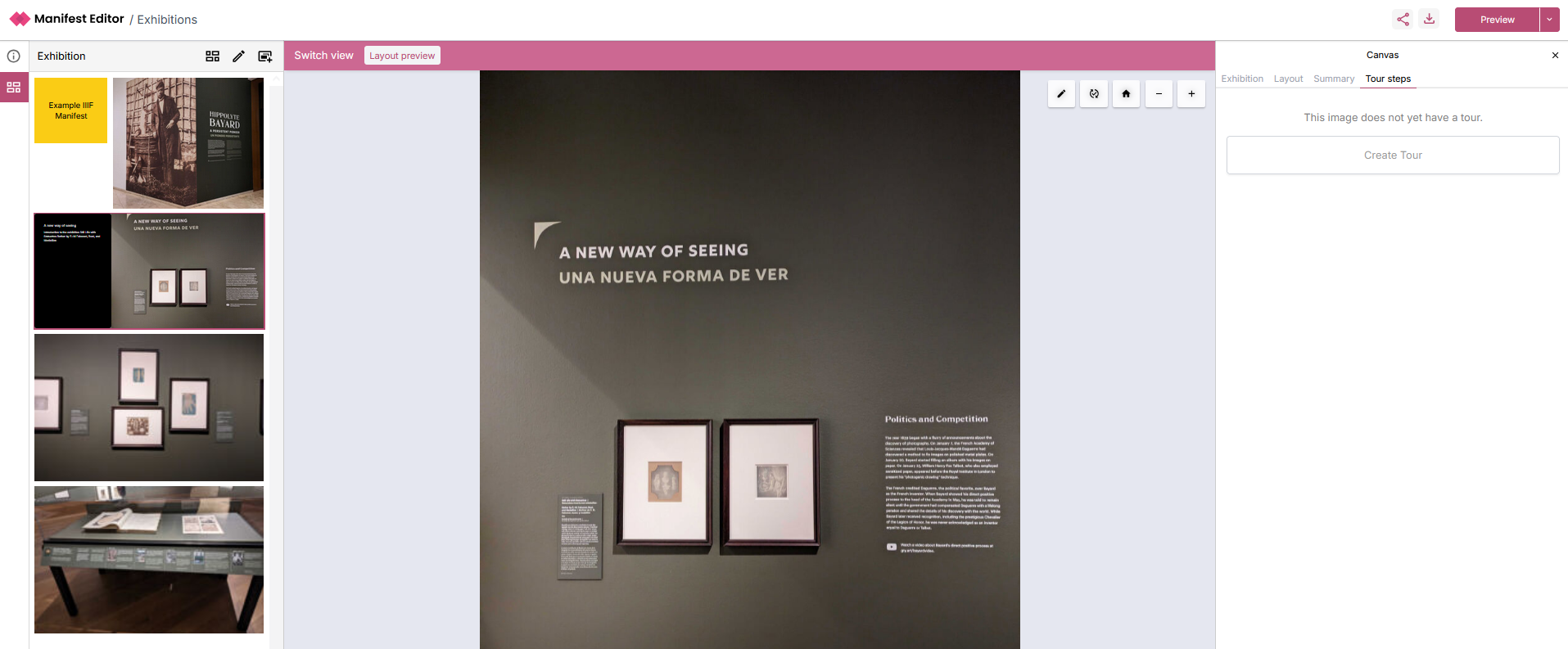
Tour Steps
The 'Tour steps' tab allows further configuration of the interaction provided for each individual slide, when viewed in the standalone Exhibition Viewer. These are not required to be set unless you want to have additional behaviour applied for the current slide.
In the multi-image slide example below, you can create ‘Tour steps’ which guide users through your exhibition, by explicitly adding additional navigation through your content.
Each of the images on the canvas have been added as a 'Tour step' so that users can be directed to each image as part of the exhibition. We'll discuss how these work, and how they can be used for other types of annotations such as an annotation on an image region for example.
As you add your Tour steps, you can add a label and summary for each step, which will be displayed in the standalone Exhibition Viewer.